Project Case Study
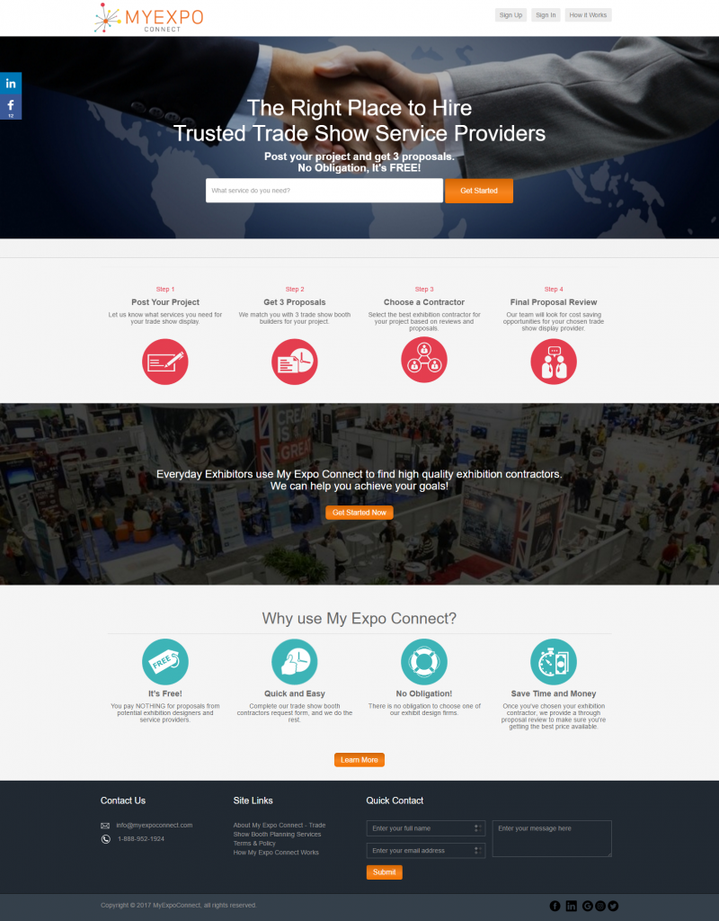
Optimizing this above-the-fold area to make the most of the screen real estate had the biggest impact of all the things I tested. Switching my opt-in box from the sidebar on the right to the header area just below my logo and navigation was a HUGE bump in visitor-to-leads conversion. Just moving our same opt-in offer from the sidebar to the header I went from 2 percent of visitors becoming subscribers to 5 percent.


